

Your website is as important to your business as flour is to bread. Why? Because almost everyone–except perhaps your 95-year-old grandmother–uses the internet to find and research businesses. Eighty-five percent of users go online to find you. It doesn’t matter what industry you’re in and it doesn’t matter if your business is a one-man show or a large corporate conglomerate–you need a website. It’s your online brochure of who you are, what you do, when you do it, where you do it, and why customers should flock to your business.
The internet is only about 25 years old. The first website, published in 1991, was text only. No graphics–just text. In its infancy, the internet was subject to dial-up, basic HTML, and a limited number of images. We’ve come a long way since then. Now, some websites, such as Pinterest and Instagram, can actually be image-centric.
In the last decade, the device choices of the masses have morphed from beefy desktops to sleek laptops to even sleeker smartphones. Now, Wired is predicting that the smartphone could become the main computing device for most folks by 2017.
The first iPhone appeared in 2007. And by 2014, mobile internet searches sprinted past desktop searches. It’s no longer enough to just have a website–now, you need a website that can cater to mobile users. Mobile-friendly, mobile-optimized, and mobile-responsive are a few of the buzzwords that have been floating around in the mobile web development world. So, what’s the difference? And which one do you pick?
A mobile-friendly website is more simple and displays the same layout on every device. It’s designed for desktop users, but has less complex functionality and smaller image sizes to accommodate mobile users. Mobile-friendly is the bare minimum in mobile web development and makes Google’s robots happy, but it may not be enough for your website.
A mobile-optimized website is a website completely designed just for mobile users (think single-column, thumb-friendly, and minimalistic design). Raise your hand if you’ve ended up on a mobile-optimized website and clicked on “View Desktop Version” so you could access familiar buttons and screens. A mobile-optimized website is easier to use, but it may be missing your favorite features.
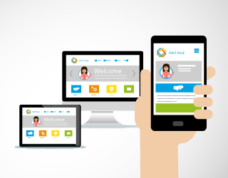
A mobile-responsive website combines the best of both mobile-friendly and mobile-optimized websites. It’s smart enough to decipher what device you’re using and to restructure to fit your device. It’s all there, but it’s easier to read and navigate.
Now that you’re convinced that you need a mobile website, you need to be aware of one more thing. You also need an optimized website. Optimization is what takes your website to the top of search results on Google, Bing, and Yahoo! After all, what good is a website if you can’t find it?
To determine if your site is optimized, the search engine robots consider whether it’s mobile-friendly, whether it has enough content, whether the content is relevant, and whether people seem to be engaging with your content. Competition for the first page of search results is tough these days and optimized sites are more likely to win one of those coveted slots.
Landing pages help your website move up on search results. They do just what their name implies. They land customers–specific customers. For instance, perhaps you provide lawn care services to customers throughout northern California, but you want to target lawn pest control in Redding, Anderson, and Palo Cedro (because, hey, you’ve noticed the moles have been getting out of hand lately). Then, you’ll want to create landing pages to draw customers in Redding, Anderson, and Palo Cedro who are sick of moles tearing up their yards.
However, you can’t just slap the same content on every landing page. The search engine robots may notice that you have a lot of cookie-cutter content and may demote your site for too many infractions. Tailor your landing pages to the customers in each location. Then, Google and your customers will both be happy to find you.
Content is great, but content is not only text. Content is also images and video. Videos, especially, are another way to help your website rise to the top. Who doesn’t like a good movie? If your customers have to choose between a boring, text-laden symposium of your services and an animated video clip, which do you think they’ll choose? Engaging content wins.

Every business is trying to sell something–widgets, the latest app, their awesome services, their one-of-a-kind training program, or something else. E-commerce is not just for those who sell widgets anymore–it’s for anyone that wants to reach customers outside of regular business hours or the local area. What can your business offer for purchase online? A product? A subscription plan? A service package?
Almost anything can be sold online these days. Amazon is now selling plumbing services. If they can, why can’t you? Let your website do the hard work of getting the necessary details and the payment from the customer. All you need to do is deliver the product or service. And you might need to get a few more employees to handle the increased business.
Your website is the most essential tool in your business arsenal. Make sure it’s professional, user-friendly, visible online, and engaging. Go ahead. Use the full potential of the web to show customers why you’re the best at what you do.
